


The reason for this email is due to my lack of creativity. I follow your blog daily and love to read all of your fun articles about DIY crafting projects. My fiance laughs that I don't have a creative bone in my body. Ok, maybe a small one is somewhere (or so I keep hoping). So, on to my point. We are getting married in this lush outdoor venue next spring and I'm stumped for colors, wondering if you could help. I like the really rich vibrant tones, but there is not one definite color I'm stuck on. My fiance wants something more masculine and dark. We want it really classy, no pastels and no black. How do we compromise? Your help is much needed!
Hopeful to have colors soon,
Krystal L.
Hi Krystal,
Thanks for your email! We appreciate our wonderful readers looking to our expert help on color concepts and theme design. If you don't mind, I thought we could share this with the readers to see if they would like to put together any inspiration boards for you or have any other color palette ideas. Below are four of our favorite suggestions, when it comes to garden style venues with lots of greenery, that we pulled from BBJLinen.com.
My best advice is to pull in something along the lines of blues, silvers, or browns for your fiance and then add in the rich vibrant colors for yourself. Then choose one to two additional accent colors to tie in subtly. Don't forget to mix up and use rich patterns to add dimension and depth to break up the flatness. Also, adding in the metallic family like gold, silver or copper will deliver a very classy, upscale quality.
{Raspberry, Blueberry, and Platinum}
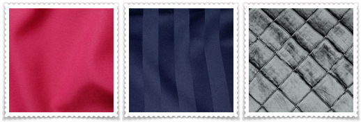
In this palette, I would predominately use the blueberry throughout in your linens, stationery pieces, and attire to keep a very rich, but elegant look and feel. The raspberry would be an highlight color used through your flowers, embellishments, girls shoes, ribbons, etc to add pop and a feminine touch. The platinum would be utilized as an accent through the flatware on the tables, men's vests, flower vases, chivari chairs, and as a secondary linen.
{Antique Gold, Red, Aqua}
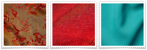
In this palette, I would predominately use the antique gold through the linens, china, chivari chairs, and even through the attire to add a very rich feeling. The red would would be a complimentary accent through flowers, embellishments, and enhancing the feminine qualities. Bringing in the aqua through the small embellishments like cake details, stationery items, and ribbon wrapped flowers will add pop and zest to your elements. Adding in the floral like pattern gives this also a very garden feel with a twist of whimsy.
{Eggplant, Gunslate, and Buttercreme Yellow}
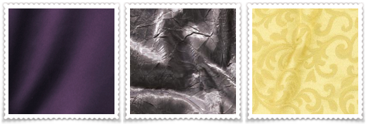
In this palette, you can use either eggplant or platinum to be your majority color. Both colors create a very strong visual that can be masculine as well as femanine at the same time. Deep eggplant linens with silver chivari's, silver chargers, silver flatware, and silver flower vase could be exquisite. The yellow brings in light and brightness through flowers, embellishments and accent pieces. While the baroque swirl adds in the garden and romantic element.
{Chocolate, Sunflower Yellow, and Lime Green}
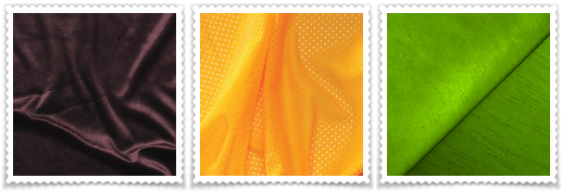
Chocolate would be the prodominate color in this palette used in most of the linens, stationery pieces and attire to add warmth and richness. The sunflower yellow would be a beautiful accent in the flowers and through the details like ribbon sashes, yellow shoes, and even the squash on the dinner plates. Green comes in in small details as well through floral pieces and stationery elements. I can just see a beautiful sunflower centerpiece with little green button flowers as napkin embellishments.
Good luck Krystal!! If you like any of these selections, please feel free to let us know and we are more than happy to help you with all the beautiful decor elements and stationery pieces to create a cohesive theme for your grande affair!
2 comments:
Good job Kim. I love all of these choices. Of course I'm a little biased, but, the Raspberry, Blueberry and Platnimu is my favorite!
You're SOOO helpful! :)
Right now, that color combo is my fav too!! I can't wait to find a client who wants to use it or I may just have to rework one of my bathrooms or guest bedrooms :) ha ha Hubby would love that!!
Post a Comment